Essential Tips for Great Typography
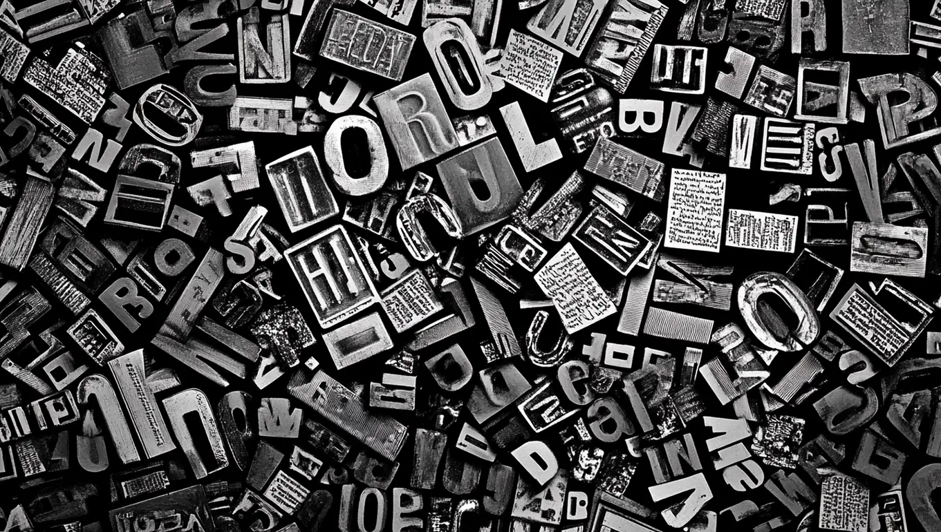
Typography is more than just selecting a font and typing out words; it’s an art form that plays a crucial role in the overall design and readability of any text-based content. Whether you're designing a website, a book, a poster, or any other medium, understanding the principles of typography can make the difference between a design that’s merely functional and one that’s visually compelling. Here are some essential tips for great typography to elevate your design work.
1. Choose the Right Typeface
Selecting the right typeface is foundational to good typography. The typeface you choose should match the tone and purpose of your content. For instance, serif fonts like Times New Roman convey a sense of tradition and reliability, making them suitable for formal documents. Sans-serif fonts like Helvetica, on the other hand, are clean and modern, ideal for digital interfaces and contemporary designs.
2. Consider Readability
Readability is the ease with which a reader can consume your text. To enhance readability, opt for typefaces that are clear and legible, even at smaller sizes. Avoid overly decorative fonts for body text, and ensure there is sufficient contrast between the text and the background.
3. Master the Art of Hierarchy
Hierarchy in typography helps guide the reader through the content by emphasizing the most important elements. Use varying font sizes, weights, and styles (like bold or italic) to create a visual hierarchy that directs the reader’s attention to key points first.
4. Pay Attention to Kerning
Kerning is the adjustment of space between individual characters. Proper kerning ensures that letters are spaced in a way that looks natural and improves the flow of text. Poor kerning can create awkward gaps and disrupt the reader’s experience.
5. Maintain Consistent Line Spacing
Line spacing, or leading, is the vertical space between lines of text. Consistent line spacing improves readability and gives your text a clean, organized appearance. As a rule of thumb, line spacing should be about 1.2 to 1.5 times the size of the font.
6. Balance Line Length
Line length refers to the width of a block of text. Optimal line length is key to maintaining readability and reader engagement. If lines are too long, readers might lose their place; too short, and the text may feel choppy. Aim for line lengths between 50 to 75 characters.
7. Utilize White Space Effectively
White space, or negative space, is the empty space around text and graphical elements. It’s essential in creating breathing room for your text, making it easier for the reader to process information. Avoid cluttering your design and embrace white space to create a more focused and balanced layout.
8. Use Contrast to Your Advantage
Contrast in typography involves differentiating elements such as typeface styles, sizes, and colors to create visual interest and clarity. High contrast between text and background colors improves readability, while contrasting font styles and sizes can highlight important content.
9. Limit the Number of Typefaces
Using too many typefaces can make your design look chaotic and unprofessional. A general rule is to stick to two or three typefaces: one for headings, another for body text, and possibly a third for accents. Consistency in font choices creates a cohesive design.
10. Align Text Properly
Proper text alignment is crucial for clean and organized typography. Most body text should be left-aligned as this is the most readable format for most languages. However, centering or right-aligning text can be effective for specific design purposes like invitations or pull quotes.
11. Beware of Widows and Orphans
Widows and orphans are terms used to describe a single word or short line that appears alone at the end or beginning of a column or page. They can disrupt the flow of your text and leave awkward white space. Adjusting line breaks and text spacing can help avoid these issues.
12. Test Your Typography on Different Devices
With content often being consumed across various devices, from smartphones to desktops, it’s important to ensure your typography looks great on all screen sizes. Test your design across different devices to check readability, scaling, and overall appearance.
13. Incorporate Responsive Typography
Responsive typography ensures that your text adapts well to different screen sizes and resolutions. Utilize relative units like ems or percentages for font sizes, and consider implementing media queries in web design to adjust typography for different devices.
14. Consider the Cultural Context
Different cultures have unique typographical preferences and associations. For instance, certain colors or fonts may carry specific meanings in different regions. When designing for an international audience, consider cultural context to ensure your typography communicates the intended message.
Conclusion
Great typography is about more than just making words look good; it’s about enhancing readability, creating hierarchy, and evoking the right emotions. By choosing the right typeface, maintaining consistency, and paying attention to details like kerning and line spacing, you can create designs that are not only visually appealing but also effective in conveying your message. Remember, typography is an art and a science – balancing aesthetics with function will always lead to the best results.
Back to blog